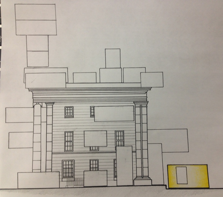
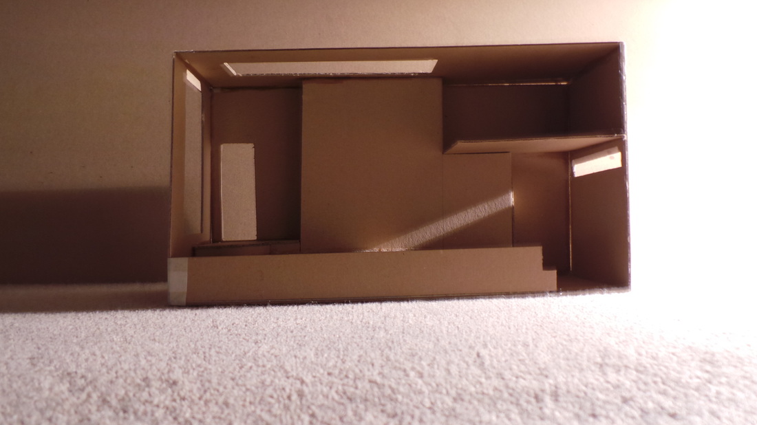
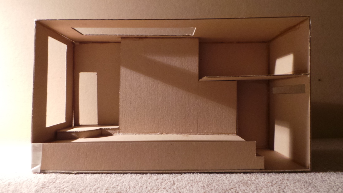
The front, west facing elevation, showing partial view of curzon street station as well as my container in context.
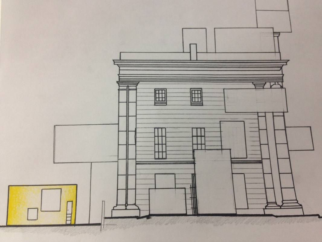
East elevation showing a partial elevation of Curzon street with my container in place. As you can see the wall which extends from the station terminates quite a distance away from my container therefore will allow my client to see views of the city centre.
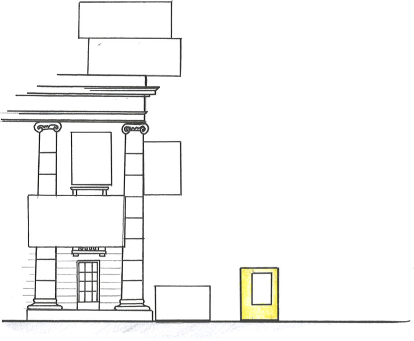
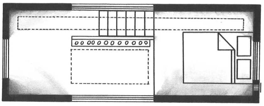
Above is the south elevation for both my container in context of curzon street station.
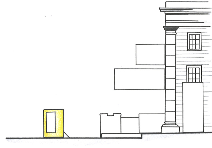
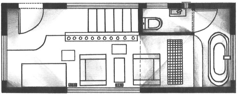
North elevation of both my container and Curzon Street Station.
This internal perspective looks on into the main living space known as the champagne living room. The champagne tinted glass wall runs along the north wall, parochially concealing the red stairs (red being my clients favourite colour). In the far background the roll top bath peaks above the main staged floor.
The next perspective shows a journey up towards the first floor mezzanine. It is interesting to see from this perspective how the 'strip' skylight acts in a way for which it guides the occupants up the stairs into a new living space.
This perspective takes a look down onto the main living space where you can see the living room / champagne area as well as the fold away kitchen.
Throughout the design process I have bee trying to incorporate how silhouettes can be used within the container. My client has a very famous and recognisable silhouette thus I wanted to incorporate this in the container. The north and south windows are opaque therefore you cannot see directly through them. People looking in on the container will only be able to see the outlines of those near windows and as my container has been positioned in a way that my client will almost likely be near a window her silhouette will be seen often.
Now that I have created a finalised design for my clients container, the posts which will be uploaded now will be drawings for which I have drawn of the container as specified in the brief for this project.
The light quality within the dwelling shows a huge improvement upon all previous designs. the image may look dark but the opaque windows on the north and south give an unobtrusive glow within the space. This quality of light at this time of day is ideal as my client will more than likely still be in bed after a long night of drinking.
9:00 am (summer)
The photograph on the left shows a demonstration to replicate sunlight entering the dwelling at around 9:00am. The space is well light with all areas illuminated. The opaque window produces a comfortable quality of light which appears to penetrate through the main living space. The light produces a warm welcoming atmosphere within the dwelling.
12:00 pm (Summer)
The midday replication shot to the left is very similar to the image taken at 9:00 but the light from the south is much more intense. The opaque window appears to control the light input thus providing a comfortable living environment. The photo on the right shows how light travels through the space, illuminating the stairwell as well as surrounds areas such as parts of the bedroom mezzanine and the entrance area.
3:00 pm (summer)
Left is the photo showing how sunlight will enter the dwelling at around three o'clock in the afternoon. The space overall is well light and the north light balances the light coming in from the south to produce an overall ambient lighting tone within the dwelling.
8:00 pm (summer)
Finally when testing the light quality in the evening at 8 o'clock the space was much darker as expected. Still there is sufficient natural light entering the dwelling. Artificial lighting may need to be used to enhance the lighting at this time of day. Note: natural light is still entering through the north facade as seen through the W/C window.
In order to visualise the anticipated changes to my containers design I have created a 1:20 scale sketch model which I will then test to see if the changes made have improved the natural light quality.
Image above displaying the opaque south window as well as the large window to the west of the dwelling.
North elevation with the new opaque window similar to the one on the south facade.
The above two photographs show the new elements to each facade. The north and east facade in the left show the new W/C window as well as the new east elevation window into the bath area and bedroom. The photograph on the right displays the roof with the new 'strip' skylight as well as the difference in window styles, the north being opaque whilst the east is considered traditional.
After discussing my latest design for my clients container with my tutors I have analysed and began to make plans for my final design and how my design can be adjusted to better improve light quality.
Above shows how I plan to change the south facing window. By removing the 'L' shaped window it will now be replaced with a long rectangular window which will be the same width as the stairs.
The sky light has also been changed so that it will create the illusion that glass is wrapping the structure as well as the main living space within the container. A new narrow strip skylight will also be incorporated to bring light into the bedroom and stair way where it was once a dark and windowless space.
The North Elevation sees the most improvements in terms of lighting. A large window which is opposite to the one on the south side will be installed creating an area where the client can see outside from both elevations. More natural light will be able to penetrate ingot he main, public living space. However the glass will also be opaque so that only silhouettes of the occupants can be seen from the outside.. North light is also desirable as it is said to be of a constant quality unlike south light which can change intensity throughout the day. Another minor change is the addition of a window into the downstairs wash room. Artificial lighting was planned on being used but why not use natural light and save on energy?!
The image above shows the wall which separates the living room from the stairs up to the mezzanine level. The wall will no longer be solid but will now be contracted from glass tinted in an off peach colour, similar to the colour of champagne. This will introduce a new type of light into the area as well as creating the illusion of space.
To the left is the final change that will be made to the container. The 'prison style' window will now be replaced with a full length window similar to the one on the west elevation. It will drastically increase light levels within both the bathroom and the bedroom, two areas which here darker than the other spaces when it came to the last light test.
Today I have had a review with my tutors to discuss where I am with the project. After a lengthy discussion which involved looking at my sketches, ideas, drawings and research I was allowed to move onto Phase 2 of the project which involves making a change to my design in order to enhance the lighting qualities within the container I have designed for Marilyn Monroe.
As I am submitting my project a week earlier I have set myself goals to achieve and things that I need to do: - Adjust site plan and make final amendments to my site presentation panel. - Collate research for precedence and create a Precedence Study Panel. - Make changes to final design (discussed with tutors) - Produce 1:20 or 1:50 sketch models - test for lighting. - Produce orthographic drawings - plans, sections, elevations, exploded. - Rendered image of interior. - Environmental drawings - plan and section scale 1:50 to show lighting. - Produce final scaled model. - Design development photography panel.
Above is the 'Site Panel' which will be used as part of my final presentation. The panel consists of a collection of research areas of the site and will be referenced when presenting my design -the site has influenced my container quite a lot.
As part of my brief I am required to make a set amount of 1:50 scale sketch models. These have proved beneficial in being able to visualise and design the space to ensure I am meeting my clients requirements. below are the Sketch models I have made for proposals 2, 3, 4 and 5.
Proposal 2 Sketch model
The sketch model for this proposal confirmed that the design is cramped and does not utilise the space particularly well. Further sketches were completed at this point which progressed to the next proposal.
Proposal 3 Sketch model
- Day time layout -
- Night time layout -
The sketch model for the third proposal is very similar to the second one however I have tried to regain more floor space by looking at fixtures and fittings. The bedroom area was a real sticking point in the last design as it seemed as though I had simply 'stuck' it within the given space. This proposal show stye use of a Fold Away Bed. this allows for maximum floor space to be used during the day and then the area can be converted into a bedroom at night. The floor vent to replicate 'The seven year itch' scene with Marilyn's dress flowing up has been incorporated underneath the bed so when it is folded away it can be used.
Proposal 4 sKETCH
My forth proposal for my clients space is a stark change to the previous designs I have produced. By taking into consideration my clients anthropometric data I have been able to introduce a mezzanine level within the dwelling. As illustrated above this has freed up a vast amount of ground floor space. A new skylight has been introduced as well, mainly to improve the light quality and emittance within the space as the previous models seemed quite dark. The only issue now is to address access up to the mezzanine. Currently my client will need to climb a ladder built into the wall. I believe this does not suit my client and it is now my task to improve on this feature.
Proposal 5
The fifth proposal again changes the dynamics of the space one more. The developments within this design incorporate the use of a stairs (This model size was difficult to create a staircase, see previous 1:20 model) which improves the access to the mezzanine immensely. Another change made is the bathroom. The ceiling height within this space was a bit excessive therefore I have designed a sloping roof. The roof intersects the window, which have made larger therefore emitting more light into the main living area as well as light into the bathroom. The skylight has also been made larger thus allowing for more light generally to penetrate into the main living space where my client will spend the majority of her time within.
With my latest design now incorporating a large south facing window, this can bring up a few issues. I already know that south light is not a constant quality of light and can be intensive at certain periods of the day unlike north light which is relatively constant. So I have taken it upon myself to research how I can overcome the implications of having south facing windows and I came across Solar Shading. Solar shading is the term used to identify a number of systems to control the amount of heat and light from the sun admitted to a building. By doing so, solar shading devices can offer energy saving in various areas:
They can reduce the amount of energy required for heating or cooling by keeping the excessive heat of the sun out and avoiding overheating
They can also cut the amount of energy required for lighting, by optimizing the admittance of more free, natural daylight
They will enhance indoor comfort and stimulate productivity
Solar shading is an effective complementary strategy to air conditioning or mechanical ventilation, providing savings in running costs as well as general energy savings and reduced CO2 emissions.
As I am not allowed to protrude from the given dimensions of the container due to manufacturing and shipping reasons, I will need to consider using internal methods of solar shading such as roller blinds or even drapes.
As part of my brief for Project 3 , I am required to draw a 1:200 Scale site plan of the site I have been given. The site plan shows where the Old curzon Street Station is within the site as well as my container and everyone else's container in my year.
Comparing this spacial relationship diagram to the previous ones I have created, the one show above provides a space which flows very nicely. Each area connects with one another but is still 'zoned'. The bathroom area has increased considerably in size due to the new roll top bath, but this layout suits my client a lot better. The living room is now in proportion to the rest of the space including what is now the 'Champagne Walkway' and the dry area. The kitchen is a lot smaller but this is mainly because my client will not cook a lot as she will be eating out for the majority of the time, thereofre more floor space was freed up to use in other more used areas.
As with the previous light test I carried out, I tested the new 1:20 Model using the angles on the sunbathe diagram I drew previously. The test uses the summer sunbathe and the results are as follows.
Morning
As you can see from the photographs, during the morning when the sun is low, very little light enters the building. The majority that does comes mainly from the long sky light above. When the interior is painted in lighter colours this will hopefully reflect more light into the interior spaces.
noon
When testing light qualities during the afternoon, the bedroom and bathroom areas are quite dark whilst the rest of the space is very bright, due to the new south facing window and the sky light. the stairs is completely dark which makes me want to look into either putting a north facing wind or incorporating artificial lighting. phase two of the project might come in handy here.
Evening
The evening presents a space for which is well light without the need for the assistance of artificial lighting. All areas are bright.
At the start of last fridays studio we were each given the task to produce a 1:1 scale object that our clients might bring into the dwelling. I decided my client may brink in a shoe rack where she can store al her high heels. We then as a year group mocked out the space for which we have to work with (the shipping container). Myself and the 1:1 object then went to see if we could fit in the space keeping in mind the designs I had in place.
Now that I have secured a position within the site of Old Curzon Street Station I wanted to test the light quality. The experiment below looks at light quality during the summer (21st june) from morning, noon and evening.
Morning
As you can see, in the morning the light illuminates a vast amount of the space, in particular within the bedroom and the kitchen areas, which are two areas that my client may be in during the morning hours.
Noon
The afternoon however presents a stark contrast to the morning with the majority of the dwelling in shade except for the double height void above the champagne bar and living room. This may be an aspect of the dwelling were additional windows may be added or to look into the benefits of artificial light fittings.
Evening
In the late evening the front of the dwelling is flooded with light, especially in the kitchen. It is also key to note how the roof light casts light onto the slanted roof of the bathroom which itself reflects light back into the main room - making this area surprisingly bright and airy. The bedroom is dark in comparison to the rest of the spaces which is a requirements of my client (maybe to conceal a secret lovers?).
In order to gain an idea of the sizes and dimensions of fixtures and fittings I have carried out research to see how items such as a bath, a toilet or even a bed will fit both the space and my client.
Doorways / Entrance
I needed to make sure that I had a sound understanding of standard door heights to make sure my client could actually get inside her container. From analysing this particular diagram my client will almost certainly fit through a standard door way, and I can even make the door lower in height and narrower in width.
kitchen
In order to show that I have some awareness into standard kitchen dimensions as well as appliance sizes I researched the size and dimensions of kitchen units as well as a cooker and a dishwasher.
My client however will not require as an extensive kitchen as I first thought. my client will most likely be going out to eat on a regular or even daily basis. The only thing the kitchen would be used for is to make a morning cup of coffee and maybe breakfast.
The kitchen in the latest proposal - Number 6, will involve a 'CUSTOM, MADE TO MEASURE' kitchen which will suit my clients needs.
Living area
Traditional sofa sizes are quite large and when I tried to position them within the container in earlier designs they seemed to take up the majority of the floor space. Hence the reason why I have chosen to simplify incorporate two small arm chairs in the living area. My client finds it difficult to socialise therefore will not be needing a large seating area as not many people will be visiting.
Bathroom
Above are standard dimensions for bathroom fixtures and fittings. Originally the small washroom was simply made up from a sink, toilet and a shower. When I looked back over my designs I couldn't really visualise my client using a shower! So a total redesign of the space was required hence the conception of proposal 6. A roll top bath, an item of luxury, has now been proposed whilst the toilet and sink are concealed underneath the stairs, out of the way.
Stairs
Above are the standard sizes for stairs. Stairs will be used within the space I have designed to add aid in the division of space bit to also make it quirky inside.
Bedroom
The bed size I have had in mind since the launch of the project was a double bed. As my client is from America, I have researched standard American bed sizes and the diagram above illustrates this. The sizes are very similar to the uk.
Champagne
The measurements for champagne glasses and bottles varies, therefore i am going to take a rough estimate and suggest a bottle of champagne is 30cm tall and 10cm in diameter. A champagne glass will also vary due to design but typically they are 15-20cm tall and 5-6cm in width.